Creating TreeView using Grid in Silverlight (Component One – Cell Factory) – III

[Component one already have a new attribute in C1FlexGrid ‘ ChildItemsPath=”Children” which will create the tree view look and feel without any of this custom cell factory. I did it anyway as a means to learn]

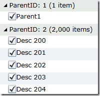
In the previous blog post, we took our first step in creating tree view look and feel using C1FlexGrid. With some basic changes we were able to get to the result close enough.

image

Few things missing for the grid to look like tree view, they are

1. When parent do not have a child, the expand and collapse icon should not appear.

2. We are missing check box along with parent id.

We can resolve both the problems using Cell Factory.  What does cell factory do? Cell Factory is used by C1FlexGrid to draw cells. It has bunch of methods that you can override so that you can implement your own drawing mechanism. In our case, when it create the cell content, I need to check if the content is a group row, then add my own cell creating logic put check box else let the grid do its work. So we create our custom class off of CellFactory. All the code you are going to see below is stripped down version of Component One’s iTune sample code.

public class MyCellFactory:CellFactory
{
}

The method we need to override to achieve custom cell content create is ‘CreateCellContent’ method. In this method, we will check, if the cell belongs to a group row and if it is first column then create me the custom cell.

static Thickness _emptyThickness = new Thickness(0);

//bind a cell to a range
 public override void CreateCellContent(C1FlexGrid grid, Border bdr, CellRange range)
{
     var row = grid.Rows[range.Row];
     var col = grid.Columns[range.Column];
      var gr = row as GroupRow;

      if (gr != null)
          bdr.BorderThickness = _emptyThickness;

      if (gr != null && range.Column == 0)
     {
          BindGroupRowCell(grid, bdr, range);
          return;
      }
      base.CreateCellContent(grid, bdr, range);
}


One point of interest in the above method call is ‘BindGroupRowCell’. This method will create the custom cell for us. This has two important parts in it, first one is to make sure the group row has a databinding source and also create custom cell and add it to its cell content.

private void BindGroupRowCell(C1FlexGrid grid, Border bdr, CellRange range)
{
     var row = grid.Rows[range.Row];
     var gr = row as GroupRow;

     if (range.Column == 0)
     {
          if (gr.DataItem == null)
         {
              gr.DataItem = BuildGroupDataItem(gr);
         }

        Type cellType = typeof(ParentCell);
        bdr.Child = (ImageCell)new ParentCell(row);

     }
}

In our grid, every row has an associated data row except the group row. Since group row does not have data item, we will, create an temporary data row, that we can use to bind it to the grid. When we group the rows to generate the grouping in data grid, the group knows about all the children of the group. We conveniently pick the first row and use the data to generate the dummy row that we use to bind it to group row.

CustomCellFactoryForTreeView.MainPage.Person BuildGroupDataItem(GroupRow gr)
{
     var gs = gr.GetDataItems().OfType<CustomCellFactoryForTreeView.MainPage.Person>();
     CustomCellFactoryForTreeView.MainPage.Person p = new CustomCellFactoryForTreeView.MainPage.Person();
      if (gs != null && gs.Count() > 0)
            p = gs.ElementAt(0) as CustomCellFactoryForTreeView.MainPage.Person;
       return new CustomCellFactoryForTreeView.MainPage.Person()
      {
            ParentID = p.ParentID,
            Description = p.Description,
            ChildID = p.ChildID,
            ChildDescription = p.ChildDescription
       };
 }

Now lets look at the main core functionality to  create the check box and text in the group row. Again following code is purely stripped down version itunes sample in C1 samples.  Lets first create the ParentCell

    public  class ParentCell : ImageCell
    {
        const double ALPHA = 0.5;
        GroupRow _gr;
        Image _nodeImage;
        static ImageSource _bmpExpanded, _bmpCollapsed;

        public ParentCell(Row row)
            : base(row)
        {
            CustomCellFactoryForTreeView.MainPage.Person per = row.DataItem as CustomCellFactoryForTreeView.MainPage.Person;
            if (per != null && per.ChildID != null)
            {
                // create collapsed/expanded images
                if (_bmpExpanded == null)
                {
                    _bmpExpanded = ImageCell.GetImageSource("Expanded.png");
                    _bmpCollapsed = ImageCell.GetImageSource("Collapsed.png");
                }

                // store reference to row
                _gr = row as GroupRow;

                // initialize collapsed/expanded image
                _nodeImage = new Image();
                _nodeImage.Source = _gr.IsCollapsed ? _bmpCollapsed : _bmpExpanded;
                _nodeImage.Width = _nodeImage.Height = 9;
                _nodeImage.VerticalAlignment = VerticalAlignment.Center;
                _nodeImage.Stretch = Stretch.None;
                _nodeImage.MouseLeftButtonDown += img_MouseLeftButtonDown;
                _nodeImage.MouseEnter += img_MouseEnter;
                _nodeImage.MouseLeave += img_MouseLeave;
                _nodeImage.Opacity = ALPHA;
                Children.Insert(0, _nodeImage);
            }
            // make text bold
            TextBlock.FontWeight = FontWeights.Bold;
        }
        void img_MouseLeftButtonDown(object sender, MouseButtonEventArgs e)
        {
            var img = sender as Image;
            var cell = img.Parent as NodeCell;
            cell.IsCollapsed = !cell.IsCollapsed;
        }
        void img_MouseEnter(object sender, MouseEventArgs e)
        {
            var img = sender as Image;
            img.Opacity = 1;
        }
        void img_MouseLeave(object sender, MouseEventArgs e)
        {
            var img = sender as Image;
            img.Opacity = ALPHA;
        }
        public override Row Row
        {
            set
            {
                // update image
                _gr = value as GroupRow;
                _nodeImage.Source = _gr.IsCollapsed ? _bmpCollapsed : _bmpExpanded;
                _nodeImage.Opacity = ALPHA;

                // update text
                base.Row = value;
            }
        }
        public bool IsCollapsed
        {
            get { return _gr.IsCollapsed; }
            set
            {
                _gr.IsCollapsed = value;
                _nodeImage.Source = value ? _bmpCollapsed : _bmpExpanded;
            }
        }
    }

The point of interest in here is the constructor, where we check if there are any children available. If there is any child available, then we show expand or collapse icon. If there are no children then do not show any icon. We also add event handler which listens to the click event on the image and based on the event, it toggles the state. With this change, we took care the icon to show only when there is children. One thing left to do is, adding check box to the control. This is accomplished at base class ‘ImageCell’.

The Image cell is derived from StackPanel so it is easy to customize it to the look you want.

    public abstract class ImageCell:StackPanel
    {
        public ImageCell(Row row)
        {
            Orientation = System.Windows.Controls.Orientation.Horizontal;

            CheckBox box = new CheckBox();
            box.VerticalAlignment = System.Windows.VerticalAlignment.Center;
            box.Click += new RoutedEventHandler(box_Click);
            Children.Add(box);

            TextBlock tb = new TextBlock();
            tb.VerticalAlignment = System.Windows.VerticalAlignment.Center;
            Children.Add(tb);

            BindCell(row.DataItem);
        }

        void box_Click(object sender, RoutedEventArgs e)
        {
            int k = 0;
        }

        public TextBlock TextBlock
        {
            get { return Children[Children.Count - 1] as TextBlock; }
        }

        public CheckBox CheckBox
        {
            get
            {
                return Children[Children.Count - 2] as CheckBox;
            }
        }

        public virtual Row Row
        {
            set { BindCell(value.DataItem); }
        }

        private void BindCell(object dataItem)
        {
            var binding = new Binding("Description");
            binding.Source = dataItem;
            TextBlock.SetBinding(TextBlock.TextProperty, binding);
            var cbbinding = new Binding("TwoState");
            cbbinding.Source = dataItem;
            CheckBox.SetBinding(CheckBox.IsCheckedProperty, cbbinding);
        }

        public static ImageSource GetImageSource(string imageName)
        {
            var bmp = new BitmapImage();
            bmp.CreateOptions = BitmapCreateOptions.None;
            var fmt = "Resources/{0}";
            bmp.UriSource = new Uri(string.Format(fmt, imageName), UriKind.Relative);
            return bmp;
        }
    }

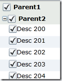
The final result of course is like the following

image

Our requirement is to have a check box and a text block in the group row and that is what we did in the constructor of the ImageCell. Once it is created we need to bind it to the proper fields. That’s is what done in the BindCell method. One thing, it is important here on how you get to the control for doing the binding. Please see the TextBlock getter property, which in turn take the first child from the children collection and return it for binding. If you remember the children have three elements and they are in the following order. First element (at 0) is image for collapse and expand. Second one is the check box (at 1) and third one is the TextBlock (at 2). I was so lazy to I hard coded it to get the elements by hard coded index. You can traverse and identify the control to make it flexible if you want to move around the control. One another thing, you may want is to listen to the check box click event that you can listen with click event.

I would like to thank Bernardo @ Component One to take time to answer my questions and excellent example of itunes on their web site. This three part blog was more for me to understand how the whole components works together and what you can do with this. You can customize the grid any way you want. In this whole example we looked at only one method, create cell, but there are five or six more methods available completely change the look of the grid.
Creating TreeView using Grid in Silverlight (Component One – Cell Factory) – II

[Component one already have a new attribute in C1FlexGrid ‘ ChildItemsPath="Children" which will create the tree view look and feel without any of this custom cell factory. I did it anyway as a means to learn]

In the previous blog post we looked the problem at hand. In this post I am going to go through steps on how to get as close as  to the tree view using C1FlexGrid. I approached the problem using their iTunes sample code. They have a very good online documentation on what is in iTunes sample. 

1. I am going to change the record layout to meet grid grouping model. So my new person class is something like the following

public class Person:INotifyPropertyChanged
 {
      public string ParentID { get; set; }
      public string Description { get; set; }
      public string ChildID { get; set; }
      public string ChildDescription { get; set; }
      public bool TwoState { get; set; }

       public Person()
       {
            TwoState = true;
        }

       public event PropertyChangedEventHandler PropertyChanged;
       private void NotifyPropertyChanged(string info)
       {
             if (PropertyChanged != null)
            {
                 PropertyChanged(this, new PropertyChangedEventArgs(info));
             }
        }
}


2. Since we need to do grouping I am changing my data collection to PagedCollectionView and load some data like the following;

private PagedCollectionView LoadData()

{

       List<Person> ppl = new List<Person>();

       ppl.Add(new Person() { ParentID = "1", Description = "Parent1", ChildID = null, ChildDescription = null });

       for (int i = 0; i < 2000;i++ )

            ppl.Add(new Person() { ParentID = "2", Description = "Parent2", ChildID = "20"+i.ToString(), ChildDescription = "Desc 20"+i.ToString() });

       for (int i = 0; i < 2000; i++)

            ppl.Add(new Person() { ParentID = "3", Description = "Parent3", ChildID = "30"+i.ToString(), ChildDescription = "Desc 31"+i.ToString() });

       ppl.Add(new Person() { ParentID = "4", Description = "Parent4", ChildID = "40", ChildDescription = "Desc 40" });

       ppl.Add(new Person() { ParentID = "4", Description = "Parent4", ChildID = "41", ChildDescription = "Desc 41" });

       return new PagedCollectionView(ppl);

}


3. Before we bind the data to the grid, we will create the grouping up front based on parent id.

using (People.DeferRefresh())
{
     People.GroupDescriptions.Clear();
     People.GroupDescriptions.Add(new PropertyGroupDescription("ParentID"));
}
_grid.ItemsSource = People;


4. Now to render data, we go to XAML

<c1:C1FlexGrid x:Name="_grid" AutoGenerateColumns="False" HeadersVisibility="None">
    <c1:C1FlexGrid.Columns>
       <c1:Column Header="Data">
             <c1:Column.CellTemplate>
                   <DataTemplate>
                         <Grid>
                             <Grid.ColumnDefinitions>
                                 <ColumnDefinition Width="15"/>
                                 <ColumnDefinition Width="15"/>
                                 <ColumnDefinition Width="*"/>
                             </Grid.ColumnDefinitions>
                             <TextBlock Text=" " Grid.Column="0"/>
                             <CheckBox IsChecked="{Binding TwoState}" Grid.Column="1"/>
                             <TextBlock Text="{Binding Converter={StaticResource Description}}" Grid.Column="2"/>
                        </Grid>
                    </DataTemplate>
                </c1:Column.CellTemplate>
            </c1:Column>
        </c1:C1FlexGrid.Columns>
</c1:C1FlexGrid>


In the above code, we have a converter in place. It simply check if the child description has value then use it, if not, use parent description.

public class DescriptionConverter:IValueConverter
    {

        public object Convert(object value, Type targetType, object parameter, System.Globalization.CultureInfo culture)
        {
            CustomCellFactoryForTreeView.MainPage.Person per = value as CustomCellFactoryForTreeView.MainPage.Person;
            return (per.ChildDescription != null) ? per.ChildDescription : per.Description;
        }

        public object ConvertBack(object value, Type targetType, object parameter, System.Globalization.CultureInfo culture)
        {
            throw new NotImplementedException();
        }
    }

5. Since we want to grid to look like TreeView, I removed the column and row heading with

HeadersVisibility="None"

in the C1FlexGrid attribute.

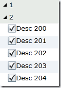
So far, we did nothing that important. This is simple data binding with the grouping. Now if you would run the code as it is, what you get is a grid with grouping applied to parent id.

image

As you would notice the first group does not have any children. Since we used converters, it puts parent’s description in the child row. But if you would use TreeView, if the parent does not have a child then it will not show child row to start with. We can fix that easily with the following hack

foreach (Row row in _grid.Rows)
{   
 if (row.DataItem != null)    
 {      
   Person p = row.DataItem as Person;      
   if (p.ChildID == null)        
      row.Height = 0;  
 }
}

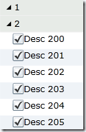
Now if you would run, you will see the child is hidden from the list.

image

We got the children to show up properly. The next step to make it like tree view is to change the parent id to show a check box and parent id information. Also remove the total number of items in parentheses.

One thing that we can easily resolve in the current model is changing the group header to show parent ID instead of all these three values. This can be done by implementing a groupheader converter as follows

_grid.GroupHeaderConverter = new GroupHeaderConverter();


and the group header conversion is nothing but a normal converter. Which check and see if the row is a group row then just return group name nothing else

class GroupHeaderConverter:IValueConverter
    {
        public object Convert(object value, Type targetType, object parameter, System.Globalization.CultureInfo culture)
        {
            // return group name only (no counts)
            var group = value as CollectionViewGroup;
            if (group != null && targetType == typeof(string))
            {
                return group.Name;
            }

            // default
            return value;
        }
        public object ConvertBack(object value, Type targetType, object parameter, System.Globalization.CultureInfo culture)
        {
            throw new NotImplementedException();
        }
    }

Now if you would run the result would be one step closer to where we need to be

image

Now what we need to add check box to the parent node then we are all set.

Creating TreeView using Grid in Silverlight (Component One – Cell Factory) – I

[Component one already have a new attribute in C1FlexGrid ‘ ChildItemsPath="Children" which will create the tree view look and feel without any of this custom cell factory. I did it anyway as a means to learn.]

Silverlight 4 tree view have one performance problem, when you try to expand a node with 1000 odd children, it takes close to 10 to 14 second to load. But it is only the initial cost, once the data loaded into memory, when you expand or collapse the same node it expands quickly. If you have many number of nodes with 1000s of children then you are going incur the cost of each node expansion. As you can imagine it does not go very well with the end users. For starters, it will not go past QA when they see that bad of performance. So I was thinking about adopting data grid to display the same content, yet make it look like tree view. The reason I chose grid instead of any other controls is virtualization. I tested a simple grid with same amount of data in it and it was simply amazing. It was so fast. You can’t time it since it expand and collapse instantly.

I have been using Component One control lately for our development and I very comfortable using it. I decided to develop the grid using C1FlexGrid and one of its power feature called cell factory. I never really appreciated the full power of  till I attempted to solve my problem using cell factory. I decided to blog about it as a document of this feature and as a reference for future. The best reference if you want to learn how the cell factory can be used, I would recommend you to get to Component One web site and look for Silverlight FlexGrid samples. There is also a PDF documentation explaining in detail how to use cell factory with an iTunes like grid.

Ok, that is enough talk, lets see the problem at hand. Let me first show, what am I trying to solve and then we see the code.

image

image

The first picture shows the parents collapsed and the second picture shows the first parent expanded. To make this exercise simple, I have only two level. There are 1000 parents and every even parent have 500 children. Lets look at the class definition for the collection. The class is called Person and shown as follows

 1: public class Person:INotifyPropertyChanged
 2: {
 3:     public string Name { get; set; }
 4:     public int Age { get; set; }
 5:     public bool TwoState { get; set; }
 6:     public ObservableCollection<Person> Children { get; set; }
 7:    8:     public Person()
 9:     {
 10:         TwoState = false;
 11:         Children = new ObservableCollection<Person>();
 12:     }
 13:    14:     public event PropertyChangedEventHandler PropertyChanged;
 15:     private void NotifyPropertyChanged(string info)
 16:     {
 17:         if (PropertyChanged != null)
 18:        {
 19:             PropertyChanged(this, new PropertyChangedEventArgs(info));
 20:        }
 21:     }
 22: }

Following code load the data to be displayed on the treeview

 1: private void LoadPeople()
 2: {
 3:      _people = new List<Person>();
 4:      for (int i = 0; i < 1000; i++)
 5:      {
 6:           Person p1;
 7:           if (i % 2 == 0)
 8:          {
 9:               p1 = new Person() { Name = "parent" +i.ToString(), Age = 20 };
 10:               for (int j = 0; j < 500; j++)
 11:                  p1.Children.Add(new Person() { Name = "Child" + j.ToString(), Age = 10 });
 12:          }
 13:          else
 14:          {
 15:              p1= new Person() { Name = "Parent" + i.ToString(), Age = 20 };
 16:          }
 17:          _people.Add(p1);
 18:     }
 19: }

As one of my friend pointed out, it is better to use string.format rather than ‘+’ in string operations. Now lets look at the XAML which does the actual work of showing the data

 1: <controls:TreeView Grid.Column="1" VerticalAlignment="Stretch" VirtualizingStackPanel.VirtualizationMode="Standard"
 2:                                    ItemsSource="{Binding People}" >
 3:      <controls:TreeView.ItemTemplate>
 4:           <common:HierarchicalDataTemplate ItemsSource="{Binding Children}">
 5:                 <StackPanel>
 6:                     <Grid>
 7:                         <Grid.ColumnDefinitions>
 8:                             <ColumnDefinition Width="10*"/>
 9:                             <ColumnDefinition Width="90*"/>
 10:                          </Grid.ColumnDefinitions>
 11:                          <CheckBox IsChecked="{Binding TwoState}" Grid.Column="0"/>
 12:                             <TextBlock Grid.Column="1" Text="{Binding Name}"/>
 13:                       </Grid>
 14:                  </StackPanel>
 15:            </common:HierarchicalDataTemplate>
 16:        </controls:TreeView.ItemTemplate>
 17: </controls:TreeView>

With these three set of code, I am able to generate the tree view using toolkit tree view control. When you run the code initial load takes almost 30 to 35 seconds to load and then each child expand and collapse takes around 10 to 15 seconds to load. Once children are loaded in memory, future expand and collapse are very fast. The main problems are initial load and time to expand each node.

Now we know the problem at hand, we can look at how we can use C1FlexGrid to create tree view look and feel.