Unit testing in Silverlight – Starting points.

For all the starters who are venturing into Silverlight testing, I would like to pass on couple of pointers that might help in your testing endeavor.

1. Make sure you create test project using ‘Silverlight Unit testing project’ template to test your Silverlight application. Do not use ‘Test project’ template, it will add incorrect dlls and you will end up spend time trying to find out why in the world, there is version conflicts?

2. Most of all you might have Test Driven.Net installed in your Visual Studio, do not try to test a method by right clicking the method. Rather make the test project as start up project and run the project. When Silverlight test project runs, it gives an option run a specific test using Tags of the tests. Make sure you have a break point set in your test method and run only the test you want to run, it will take you back to your project for debugging.

3. You will run into a situation where you might want to read a data file sooner or later. This can be achieved in two ways.

One is embedding the items in request as resource at the client side.

The second approach is to put the required files in web site which is hosting your Silverlight test application and use ‘HttpWebRequest’ to load the files asynchronously. Loading data asynchronously is little tricky, but there are solution on the web. When you created the test project, if you choose to use dynamic hosting then the second approach is not going to work. If you decide to go with this approach make sure when you create the Silverlight Test Project to enable the check box to create web page to host the application. You can find the solution for loading files in Silverlight Forum. One thing to remember, in this approach your data files lives in web project.

I like the idea embedding the required files as long as they are not very huge. Also when you are using second option, your will end up writing your test methods in delegates. On the other hand, if you would use embedded resources, all you test will be in a single method.

Working with Grid SelectedItems without any line of code in code behind

This is another blog related to creating clean separation of View and ViewModel. When you use Grid and have to act on a single selected item, just pass ‘SelectedItem’ in the command parameter. What happens when you need to act with multiple rows, it is also as simple as using SelectedItems in the command parameter. With this you do not need to write anything in the code behind, especially navigate through the collection of selected items to publish the result to ViewModel. I do not like this idea of coding in code behind in this scenario, especially you are exposing the model to the view when you are boxing individual elements. If you would expose the Model to View then you are breaking the fundamental MVVM pattern. Fortunately we can achieve this without any line of code in the code behind.

XAML

<Button Content="Selected Items" Command="{Binding SelectedItemsCmd}" CommandParameter="{Binding ElementName=grid, Path=SelectedItems}" Grid.Column="1" />
 <c1:C1FlexGrid Name="grid" ItemsSource="{Binding Rows}" AutoGenerateColumns="True" Grid.ColumnSpan="2" Grid.Row="1" />

In XAML binding, we say we are going to execute ‘SelectedItemsCmd’ which takes all Selected Items from the grid as the parameter.

ViewModel


public IActionCommand<object> SelectedItemsCmd { get; set; }

        public void SelectedItemsTest(object parameter)
        {
            List<string> temp = new List<string>();
            foreach(var item  in (IList)parameter)
            {
                temp.Add(item.ToString());
            }
        }


I am using Jounce as my MVVM framework and Component One for my grid control. Component One returns IList of objects. So in my case, the data binding happens to be List<string> so I walk through the returned object collection and cast each object the I need to box and I use it in my View Model. Thanks to Bernardo @ Component One for help clarify IList for me.

Why SelectedValue does not show up on initial page load in Silverlight for ComboBox Control?

One of my colleague ran into this problem last week and thought of sharing the problem solution and one excellent side benefit. Let me explain the problem. We have a combo box, which have list of years. Once the years property is loaded, we set the maximum value in the years field as the default selected year and show that year. Very simple, done it bunch of times no biggie. Also I want to point out here that what I have been talking about for my last couple of posts, we can  identify and resolve lot of problems with ‘Design Time Data’ than waiting for it to run.

For the people who wants to know the solution rather than all the explanation, the SlectedValue data type and ItemsSource data type were mismatching that’s why selected item did not show up in the first time load. Let me show you how to duplicate and fix the problem without even running the program.

First lets create the interface for run time and design time view model (best practices). I copied the code from the program that was failing and the properties look like the following in IMainViewModel.cs

public interface IMainViewModel
{
    List<Int16> Years { get; }
    int SelectedYear { get; }
}

you will notice that combo box going to be bound to Years of type Int16 while the selected year is int, that was the problem but at that time of writing the code I did not know that. With that interface, let me implement the Design time view model ‘DesignMainViewModel.cs’ as

public class DesignMainViewModel : IMainViewModel
{
    public List<Int16> Years
    {
        get
        {
            List<Int16> years = new List<Int16>();
            years.Add(2011);
            years.Add(2010);
            return years;
        }
    }

    public int SelectedYear
    {
        get
        {
            return 2011;
        }
    }
}

Lets look at the XAML

        <ComboBox ItemsSource="{Binding Years}" SelectedValue="{Binding SelectedYear, Mode=TwoWay}" Grid.Row="1"/>

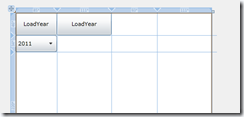
Now if you look at the design time gird, you will see the selected year is blank

image

Here itself I know there is a problem with selected year since it is not showing 2011. Now looking at the definition on IMainViewModel, instead of using two different data types, if you would switch them to same data type and change the implementation in Interface, design time and run time view model, your design screen would look like the following

image

see 2011 shows up. The solution in here is that, when you are binding a collection to a combo box, make sure the data type of the property bound to SelectedValue also have the same data type.

The best part of it all, I was able to identify the problem during the design time and was able to fix it also at the design time.

Using ChildsItemPath in C1FlexGrid to create clean MVVM code.

In the latest Component One drop, they have added a new property in C1FlexGrid called ‘ChildItemsPath’. It is a cool feature. In this blog, I am going to go through a simple example of using ChildItemsPath.

First lets see what made me to get to this property. In the current project I am working on, I had to create a grid with the following requirements

1. When there are no children in a group row, grid has to show only the group row and no child rows.

2. Group rows should be editable.

3. When user selects a row in the grid, we need to do something in the view model so I need to know which record user selected.

Just to give you an idea of the data model that I am working with.

ParentID – Parent Description – Child ID – Child Description

We are going to group on Parent ID and show Parent ID and Parent Description in the group row. So like any good old programmer, I approached this problem head on by creating a model like the one above and then created a Paged Collection View with group on Parent description, bind the collection to my C1FlexGrid. With this couple of things happened.

First one, when I have a record like the following

1 – Parent1 – null – null

where Parent1 have no children, it created a group row with 1 – Parent1 and created an empty child row. That was not expected behavior. So I wrote a small hack when the grid loading, I check and see if the rows have null value then change the height of row to 0. Pretty hack but, the group row did how expand/collapse button, giving the user the impression there is data. Next comes editing group row. I was trying to figure out how to edit the group row, while think about it, I looked at the model again and then it occurred to me, I could change my collection like the following

ID – Description

|- ID – Description

|- ID – Description

Something like

   1:  public class TestType1 : INotifyPropertyChanged
   2:  {
   3:          public int ID { get; set; }
   4:          public string Description { get; set; }
   5:          public ObservableCollection<TestType1> Children { get; set; }
   6:   
   7:          public TestType1()
   8:          {
   9:              Children = new ObservableCollection<TestType1>();
  10:          }
  11:   
  12:          public event PropertyChangedEventHandler PropertyChanged;
  13:          private void NotifyPropertyChanged(string info)
  14:          {
  15:              if (PropertyChanged != null)
  16:              {
  17:                  PropertyChanged(this, new PropertyChangedEventArgs(info));
  18:              }
  19:          }
  20:  }

Anytime when you have a collection like this, you should consider using ChildItemsPath, it is the new property added to C1FlexGrid. So how do we go about using it. Lets see the XAML

   1:      <Grid x:Name="LayoutRoot" Background="White"
   2:            d:DataContext="{d:DesignInstance sampleData:DesignMainViewModel, IsDesignTimeCreatable=True}">
   3:          <c1:C1FlexGrid ItemsSource="{Binding MyCollection1}" AutoGenerateColumns="False" Name="flex" SelectionMode="Row" ChildItemsPath="Children">
   4:              <i:Interaction.Triggers>
   5:                  <i:EventTrigger EventName="SelectionChanged">
   6:                      <i:InvokeCommandAction Command="{Binding SelectionChanged}" CommandParameter="{Binding ElementName=flex, Path=SelectedItem}"/>
   7:                  </i:EventTrigger>
   8:              </i:Interaction.Triggers>
   9:              <c1:C1FlexGrid.Columns>
  10:                  <c1:Column Binding="{Binding ID, Mode=TwoWay}"/>
  11:                  <c1:Column Binding="{Binding Description, Mode=TwoWay}"/>
  12:              </c1:C1FlexGrid.Columns>
  13:          </c1:C1FlexGrid>
  14:      </Grid>

The last parameter in line (3) is the new property I was talking about. All you have to specify, which is the child collection property in the model that it has to group on.

As you can see from the line 4-8, after learning about triggers and behaviors, I no longer write code behind code to pass data to view model. If you can get the data from the gird, then use event trigger. So in our case, the third requirement was to pass the selected item to view model when the user select a row. that is what implemented in 4-8.

Line 5 – We are interested in listening SelectionChanged event.

Line 6 – When SelectionChanged event fires, Sl intercenpts and fires View Model command implementation for Selection Changed with Selected Item from the gird as the argument.

Lets look at the View Model for command implementation

   1:          public IActionCommand<object> SelectionChanged { get; set; }
   2:   
   3:          public List<TestType1> MyCollection1
   4:          {
   5:              get
   6:              {
   7:                  List<TestType1> list = CreateData();
   8:                  return list;
   9:              }
  10:          }
  11:   
  12:          private List<TestType1> CreateData()
  13:          {
  14:              List<TestType1> list = new List<TestType1>();
  15:              for (int i = 0; i < 5; i++)
  16:              {
  17:                  TestType1 parentData = new TestType1 { ID = i, Description = i.ToString() };
  18:                  for (int j = 0; j < i; j++)
  19:                  {
  20:                      TestType1 childData = new TestType1 { ID = j, Description = j.ToString() };
  21:                      parentData.Children.Add(childData);
  22:                  }
  23:                  list.Add(parentData);
  24:              }
  25:              return list;
  26:          }
  27:   
  28:          public MainViewModel()
  29:          {
  30:              SelectionChanged = new ActionCommand<object>(
  31:                  p => {
  32:                      TestType1 t = p as TestType1;
  33:                      int k = 0;
  34:                  });
  35:          }

Line 1- Command declaration

Line 3-25 – Collection generation for XAML data binding.

Line 30-34 – Action<T> implementation for Selection Changed Command.

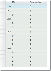
With this code if I would run I get the following screen

image

Where the first row does not have children so it does not show expand or collapse icon. Since mode is set to two way, I am able to edit group row as well as child rows. With Event Trigger, there is no code in the view’s code behind.

That’s it.

Creating Popup Dialog using Jounce Region.

It is little trickier to create a Silverlight pop up dialog box using Jounce. Jounce creates view and associate the viewmodel to it for user controls while pop up dialog boxes are derived off of ChildWindow. So you can not just navigate/region to the control. Even if you would ‘new’ up a dialog, you will lose the View Model associated with it from Jounce Frame work, since you are newing the view. If you would new the view, then you need to revert back to old school view mode injection through code behind, if you would take that approach then you are not really using Jounce to create a good MVVM code. To make it short, it is trickier to use Jounce Framework to show your Child Window (in our case we use C1Window – Component One Child Window). But as you can imagine that since I am writing the block, it is possible and surprisingly easy.

One of my colleague found a hack by goggling. Once I get the link, I will put the link up here so that you get the actual implementation by the original author. We modified a little bit to handle our situation,  Here is the solution;

1. Create a normal User Control page and wrap the content in a Canvas, it is important you have canvas, if you use Grid then the user will not able to move the pop up window around. You can only maximize, minimize and close. If you would use Canvas, then you can do all the things you do with Grid but also move the pop up window around. By default make the canvas collapsed.

2. Create a C1Window, name the control.

3. Inside the C1Window, create a ‘ContentControl’ and give a region name. Here is where we are going to place our view.

4. When user want to activate the dialog, make the Canvas visible. Also navigate to the view, which will be exported to region defined in the Content Control.

5. When all the actions are done, close the dialog, navigate back to the calling page, make the Canvas visibility to Collapsed.

I wrote a simple solution to show how it works. Here is the main page XAML, which has a button, when clicked it is suppose to show the pop up dialog.

    <Grid x:Name="LayoutRoot" Background="White"
          d:DataContext="{d:DesignInstance sampleData:DesignMainViewModel, IsDesignTimeCreatable=True}">
        <Grid.Resources>
            <local:Converters x:Key="myConverter"/>
        </Grid.Resources>
        <StackPanel>
        <Button Content="Click me" Command="{Binding ClickMe}"/>
        <Canvas Name="hiddencanvas" Visibility="Collapsed">            
                <c1:C1Window Header="Title" Height="200" Width="200">
                    <i:Interaction.Triggers>
                        <i:EventTrigger EventName="Closing">
                            <i:InvokeCommandAction Command="{Binding ClosingCommand}" CommandParameter="{Binding Converter={StaticResource myConverter}}"/>
                        </i:EventTrigger>
                    </i:Interaction.Triggers>
                    <ContentControl  Region:ExportAsRegion.RegionName="ShowMeRegion"/>
                </c1:C1Window>
            </Canvas>
        </StackPanel>
    </Grid>


The button which initiate the pop up dialog bound to the command ClickMe in the ViewModel. For time being ignore the event trigger.

*** Edit on the above code **

Replaced the trigger with behavior as follows

<i:Interaction.Behaviors>
   <local:CloseBehavior/>
</i:Interaction.Behaviors>  

local class which implements close behavior as follow
public class CloseBehavior : Behavior<C1Window>
    {
        public CloseBehavior()
            : base()
        {
        }

        protected override void OnAttached()
        {
            base.OnAttached();
            AssociatedObject.Closing += new CancelEventHandler(AssociatedObject_Closing);
        }

        void AssociatedObject_Closing(object sender, CancelEventArgs e)
        {
            e.Cancel = true;
            Canvas c = AssociatedObject.Parent as Canvas;
            c.Visibility = Visibility.Collapsed;
        }

        protected override void OnDetaching()
        {
            base.OnDetaching();
            AssociatedObject.Closing -= new CancelEventHandler(AssociatedObject_Closing); 
        }

    }

*** End Edit ****

 
[ExportAsViewModel("MainViewModel")]
    public class MainViewModel : BaseViewModel
    {
        public IActionCommand<string> ClickMe { get; set; }
        public IActionCommand<CancelEventArgs> ClosingCommand { get; set; }

        public MainViewModel()
        {
            ClickMe = new ActionCommand<string>(
                view =>
                {
                    EventAggregator.Publish("ShowCanvas");
                    EventAggregator.Publish("ShowMe".AsViewNavigationArgs());
                }
                );

            ClosingCommand = new ActionCommand<CancelEventArgs>(
                view =>
                {
                    view.Cancel = true;
                }
                );
        }

    }


If you notice the ClickMe method implementation, it fires two events. First one is called ShowCanvas, which will be intercepted at the code behind to make the canvas visible. The second event is to stage the view you want to show in the view model. Lets look at the code behind and see how it makes the canvas visible.

[ExportAsView("MainPage", IsShell = true)]
    public partial class MainPage : UserControl, IPartImportsSatisfiedNotification, IEventSink<string>
    {
        [Import]
        public IEventAggregator EventAggregator { get; set; }

        public MainPage()
        {
            InitializeComponent();
        }

        [Export]
        public ViewModelRoute Binding
        {
            get { return ViewModelRoute.Create("MainViewModel", "MainPage"); }
        }

        #region IPartImportsSatisfiedNotification Members

        public void OnImportsSatisfied()
        {
            EventAggregator.Subscribe<string>(this);
        }

        #endregion

        #region IEventSink<string> Members

        public void HandleEvent(string publishedEvent)
        {
            if (publishedEvent.Equals("ShowCanvas"))
                hiddencanvas.Visibility = System.Windows.Visibility.Visible;
        }

        #endregion

    }

If you look at the HandleEvent method at the end of the code, you will see, we are checking the incoming message to see if it is ‘ShowCanvas’ then make the canvas visible.

Now lets go back to the second call made from the view model to load the ‘ShowMe’ page. it is important that, here you use User Control, so that Jounce does the wiring for you. The ShowMe.XAMl look like the following, nothing fancy

    <Grid x:Name="LayoutRoot" Background="White">
        <TextBlock Text="Hello from Popup Window" FontSize="16"/>
    </Grid>

In the code behind, as you would do to any user control which needed to be hosted in a region, export it to the region when called.

[ExportAsView("ShowMe")]
[ExportViewToRegion("ShowMe", "ShowMeRegion")]
public partial class ShowMe : UserControl
{
    public ShowMe()
    {
        InitializeComponent();
    }
}


That’s about it. I added a small twist to the code, by listening to Closing event of the pop up window using Event Trigger. Just an experiment that’s all. You can very well add the Closing event in the code behind and all will be good as well.

True MVVM by implementing Event Triggers for non button base controls in Silverlight

First of all, I had a great time in Dallas Tech Fest. It was great. Hopefully, I get to present again next time as well.

While preparing for the presentation, I realized something, so far all the coding I have done, I did not truly develop in MVVM pattern. When I develop application which has buttons, I was able to move the code for button click event to Command thus removed code from code behind. But I did not do the same for other controls. Currently, Command only support Button Base classes. As you can guess, ListBox, ComboBox and others do not derive from Button Base, thus making use Command on these controls not possible. So I was going back to my old codes and found out that, I will adding ‘SelectionChanged’ event in the code behind and from there, I fire an event to View Model to perform an action. That was really bad, it never occurred to me to investigate this at that time. While preparing for Jounce Talk at Dallas Tech Fest I spend some more time looking at the problem and the answer was out there all along and I never noticed, as always.

So in this blog, lets look at how to remove the code from code behind for ListBox. This will be same for other controls. For simplicity, we will create a small listbox which will have three values and once the selection is made, we will display a text block at the bottom of the list box with “You selected {0}” of the value. Simple enough. First lets look at the XAML.

<UserControl x:Class="EventTrigger.MainPage"
    xmlns="http://schemas.microsoft.com/winfx/2006/xaml/presentation"
    xmlns:x="http://schemas.microsoft.com/winfx/2006/xaml"
    xmlns:d="http://schemas.microsoft.com/expression/blend/2008"
    xmlns:mc="http://schemas.openxmlformats.org/markup-compatibility/2006"
    xmlns:sampleData="clr-namespace:EventTrigger.SampleData"
    xmlns:i="clr-namespace:System.Windows.Interactivity;assembly=System.Windows.Interactivity"         
    mc:Ignorable="d"
    d:DesignHeight="300" d:DesignWidth="400">

    <Grid x:Name="LayoutRoot" Background="White"
          d:DataContext="{d:DesignInstance sampleData:DesignMainViewModel, IsDesignTimeCreatable=True}">
        <StackPanel>
        <ListBox Name="MyListBox" ItemsSource="{Binding ListItems}">
                <i:Interaction.Triggers>
                    <i:EventTrigger EventName="SelectionChanged">
                        <i:InvokeCommandAction Command="{Binding MyCommand}" CommandParameter="{Binding ElementName=MyListBox, Path=SelectedIndex}"/>
                    </i:EventTrigger>    
                </i:Interaction.Triggers>
        </ListBox>
            <TextBlock Text="{Binding SelectedValue}" />
        </StackPanel>
    </Grid>
</UserControl>


In the XAML the point of interests are

    xmlns:i="clr-namespace:System.Windows.Interactivity;assembly=System.Windows.Interactivity" 


We add the interactivity to the name space. This is very powerful dll to add behaviors, event triggers and more. The second part of interest is the triggers implementation right below ListBox

<ListBox Name="MyListBox" ItemsSource="{Binding ListItems}">
                <i:Interaction.Triggers>
                    <i:EventTrigger EventName="SelectionChanged">
                        <i:InvokeCommandAction Command="{Binding MyCommand}" CommandParameter="{Binding ElementName=MyListBox, Path=SelectedIndex}"/>
                    </i:EventTrigger>    
                </i:Interaction.Triggers>
        </ListBox>


What we are saying here is that, when SelectionChanged event fires, invoke MyCommand, with Selected Index of MyListBox. As simple as that. InvokeCommandAction is straight forward, it specifies what command in view model to execute and what are its parameter. One thing to note here, I did not send either, SelectedItem or SelectedValue. Only reason I did not send it because, those two are of type ListBoxItem. I do not want any UI related information in my view model. Since I know the collection that is bound to the List box, with selected index, I can easily find out what item was selected.

Now that we know the command, if we look at the EventTrigger, here we define which which event that we want the command to be fired. In the list box, we are interested in selection changed. If the selection changes, myCommand will be fired. You need to make sure the event name spelled out correctly. Now that we know how triggers are hooked up, lets look at the view model code.

The ListItems which are bound to the ListBox was generated as follows

private List<string> listItems = new List<string>();

        public List<string> ListItems
        {
            get
            {
                if (listItems == null)
                    listItems = new List<string>();
                listItems.Add("1");
                listItems.Add("2");
                listItems.Add("3");
                return listItems;
            }
        }

The TextBlock which displays the message is nothing but a string property.

public string SelectedValue {get; set;}

This is typical command implementation, there is nothing special about handling anything event trigger.

public IActionCommand<int> MyCommand { get; private set; }

        public MainViewModel()
        {
            MyCommand = new ActionCommand<int>(TestMethod);
        }

        private void TestMethod(int parameter)
        {
            SelectedValue = string.Format("You selected : {0}", listItems[parameter]);
            RaisePropertyChanged(() => SelectedValue);
        }

First we declare the MyCommand and then in the ViewModel constructor we instantiate it and then we implement the method which executes the command.

Creating Footer Row in Silverlight using Component One C1FlexGrid

Everyone now and then you will run into a requirement for adding a footer row for a data grid. If you are not using a third party control, you could use two grids in a user control to achieve this. Top grid houses the data and bottom grid with one row which will listen to data change in the first grid and generate the summary row.

Recently the new version of Component One, you can get the footer row out of the box if you were using C1FlexGrid/C1FlexGridExcel. Lets see how can we use it to achieve adding a footer row. Lets start out the basic requirement for this example.

1. Display personal information in a Grid, need to display, Name, Age, Sex and Salary.

2. Display a footer row which includes total number of rows, average of Age and salary total.

Lets start out building Silverlight application. Since I am a big fan of design time data and I can get that out of box using Jounce, I am going to create a new Jounce Application.

Create Model first

public class Person : INotifyPropertyChanged
    {
        public string Name { get; set; }
        public int Salary { get; set; }
        public char Sex { get; set; }
        public int Age { get; set; }

        public event PropertyChangedEventHandler PropertyChanged;
        private void NotifyPropertyChanged(string info)
        {
            if (PropertyChanged != null)
            {
                PropertyChanged(this, new PropertyChangedEventArgs(info));
            }
        }
    }


Make sure you modify the interface for View Model to get personal information (IMainViewModel.cs)

public interface IMainViewModel
    {
        List<Person> People { get; }
    }


My design time data comes from the design viewmodel

public classDesignMainViewModel : IMainViewModel

   
{

        publicList<Person> People

        {

            get

           
{

                List<Person> ppl = newList<Person>();

                ppl.Add(newPerson() { Name = "a", Age = 20, Salary = 1000, Sex = ‘f’ });

                ppl.Add(newPerson() { Name = "b", Age = 21, Salary = 1100, Sex = ‘m’});

                ppl.Add(newPerson() { Name = "c", Age = 22, Salary = 1200, Sex = ‘m’});

                ppl.Add(newPerson() { Name = "d", Age = 23, Salary = 1300, Sex = ‘f’ });

                ppl.Add(newPerson() { Name = "e", Age = 24, Salary = 1400, Sex = ‘f’ });

                ppl.Add(newPerson() { Name = "f", Age = 25, Salary = 1500, Sex = ‘f’ });

                ppl.Add(newPerson() { Name = "g", Age = 26, Salary = 1600, Sex = ‘m’});

                ppl.Add(newPerson() { Name = "h", Age = 27, Salary = 1700, Sex = ‘m’});

                ppl.Add(newPerson() { Name = "i", Age = 28, Salary = 1800, Sex = ‘f’ });

                returnppl;

            }

        }

    }

my runtime view model

[ExportAsViewModel("MainViewModel")]
    public class MainViewModel : BaseViewModel, IMainViewModel
    {
        public List<Person> People
        {
            get
            {
                List<Person> ppl = new List<Person>();
                ppl.Add(new Person() { Name = "a", Age = 20, Salary = 1000, Sex = 'f' });
                ppl.Add(new Person() { Name = "b", Age = 21, Salary = 1100, Sex = 'm' });
                ppl.Add(new Person() { Name = "c", Age = 25, Salary = 2100, Sex = 'f' });
                ppl.Add(new Person() { Name = "d", Age = 27, Salary = 2100, Sex = 'f' });
                return ppl;
            }
        }
    }

Now we have data to load, lets look at the XAML

<c1:C1FlexGridExcel Name="flex" AutoGenerateColumns="False" ItemsSource="{Binding People}">
            <c1:C1FlexGridExcel.Columns>
                <c1:Column Binding="{Binding Name,Mode=OneWay}" GroupAggregate="Count"/>
                <c1:Column Binding="{Binding Age, Mode=TwoWay}" GroupAggregate="Average"/>
                <c1:Column Binding="{Binding Sex}"/>
                <c1:Column Binding="{Binding Salary, Mode=TwoWay}" GroupAggregate="Sum"/>
            </c1:C1FlexGridExcel.Columns>
        </c1:C1FlexGridExcel>   

If you notice, all I am doing is binding the column to display and also specifying what kind of aggregation we need to display in footer row. As per the requirement, we want to total number of personal so I added the group aggregate function as ‘Count’ and Average for Age and Sum for Salary. So my design time screen will look like the following
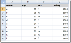
image

So far no footer row. In the current release, you can add the footer row in the code behind as follows

public MainPage()
        {
            InitializeComponent();
            var gr = new C1.Silverlight.FlexGrid.GroupRow();

           flex.ColumnFooters.Rows.Add(gr);
           }

So to add a footer row, all you have to create a group row and add that as the ColumnFooter rows. With this change if you compile and run it
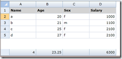
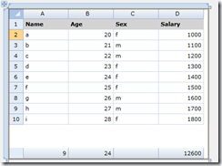
image

You can apply style, color and all the goodies you would do to any group row, you can do it here as well.

**** Update 8/5/11 *******

There is a support for design time data so you can do it in XAML itself rather than code behind, which I really like. We need to add ColumnFooterRows in the XAML that’s all about it. Modified XAML would be something like the following

<c1:C1FlexGridExcel Name="flex" AutoGenerateColumns="False" ItemsSource="{Binding People}">
            <c1:C1FlexGridExcel.ColumnFooterRows>
                <c1:GroupRow/>
            </c1:C1FlexGridExcel.ColumnFooterRows>
            <c1:C1FlexGridExcel.Columns>
                <c1:Column Binding="{Binding Name,Mode=OneWay}" GroupAggregate="Count"/>
                <c1:Column Binding="{Binding Age, Mode=TwoWay}" GroupAggregate="Average"/>
                <c1:Column Binding="{Binding Sex}"/>
                <c1:Column Binding="{Binding Salary, Mode=TwoWay}" GroupAggregate="Sum"/>
            </c1:C1FlexGridExcel.Columns>
        </c1:C1FlexGridExcel>    

With this change now if you look at the design view you will see the footer row, you do not need to run the program to see it.
image